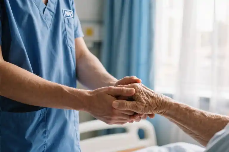
Walter’s voice was calm when he called yesterday, the kind of practiced calm people use when delivering news they know will shatter you. He’d finished the report about my son’s death – that clinical phrase we use when what we mean is ‘the report about why my child chose to leave this world last March.’ At the time, they’d explained the coroner would investigate his recent contacts with health services, any life events, any history of suicidal behavior. Standard procedure, they said, as if those words could soften the blow.
When Walter briefly summarized his findings over the phone, his tone suggested this was routine paperwork. Just another case file. Then came the instructions: to get the actual report, I’d need to complete an online form. A simple administrative step, except nothing feels simple when you’re navigating bureaucracy with grief-clouded hands.
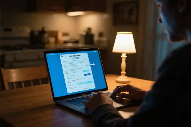
Later, sitting at my kitchen table with the coroner’s service website open, I discovered a peculiar kind of heartbreak hidden in the dropdown menus. The form asked what relation I was to the deceased. Nineteen options appeared – an illusion of comprehensiveness that collapsed the moment I read them. ‘Parent (biological)’ sat neatly alphabetized between ‘Other family member’ and ‘Parent/guardian of minor child.’ Neither applied. Not technically. Not legally. Not in the way the system required me to declare.
My cursor hovered over the empty space below the last option, as if waiting for the webpage to recognize its own inadequacy. The follow-up text demanded I ‘solemnly declare’ the accuracy of my selected relationship. I remember thinking how strange it was that a government form could make you feel both invisible and scrutinized simultaneously. That dropdown menu, with its deceptively simple design, became a perfect metaphor for how systems fail the people they’re meant to serve – not through malice, but through unimaginative construction.
There’s a particular loneliness in realizing the world has no category for your pain. The technical term for this is ‘edge case,’ when a user’s needs fall outside a system’s predefined parameters. But grief isn’t an edge case. Love defies dropdown menus. And no declaration – no matter how solemn – can capture what it means to lose a child.
The Question That Had No Right Answer
The coroner’s website form stared back at me with bureaucratic indifference. Nineteen relationship options populated the dropdown menu – a technical marvel that somehow managed to exclude the most fundamental human connection. My cursor hovered between ‘Parent (biological)’ and ‘Parent/guardian of minor child,’ both perfectly reasonable categories that somehow didn’t encompass being a mother to the young man I’d raised for twenty-three years.
Government forms always demand neat categorization, but grief refuses to be compartmentalized. The clinical terminology – ‘biological,’ ‘minor child’ – felt like administrative violence against my raw emotional state. I wasn’t filling out a survey about consumer preferences; I was attempting to formally acknowledge the death of my child while the system questioned the validity of our relationship.
Each incorrect option I clicked and discarded reinforced the surreal alienation. ‘Adoptive parent’ – no. ‘Foster parent’ – no. ‘Other relative’ – technically true, but an erasure of our actual bond. The drop-down menu became a cruel metaphor for how systems reduce complex human relationships to inadequate data points. That empty text field beneath the options seemed to mock me – there was space for my answer, just no official recognition of its validity.
The declaration at the bottom demanded I ‘solemnly swear’ the selected relationship was accurate. But accuracy wasn’t the issue – the form’s architecture couldn’t comprehend our reality. In that moment, I understood how technical design decisions become emotional experiences. What some programmer considered an exhaustive list of relationship types had become, for me, a painful reminder that my loss didn’t fit their bureaucratic templates.
Later, I’d learn this wasn’t unique to coroner’s forms – hospital visitation policies, inheritance documents, and even school enrollment systems all struggle with relationship definitions that exclude blended families, chosen families, and other modern kinship structures. But in that moment, staring at the glowing screen in my dark kitchen, all I could think was how even in death, the system kept asking us to prove we belonged to each other.
The Cold Logic Behind the Declaration
The words stared back at me from the screen, black letters on a white background demanding confirmation: “I solemnly declare that my relationship to the deceased is as stated above.” My cursor hovered over the submit button as the weight of that phrase settled in my chest. There was nothing solemn about this moment – just a hollow ache and the quiet rage that comes from being forced to categorize the uncategorizable.
Government forms love declarations. They thrive on checkboxes and drop-down menus, on the illusion that human relationships can be neatly sorted into predetermined categories. What they don’t account for is the mother whose fingers tremble too much to click accurately, or the way grief makes simple questions feel like interrogations. That word “solemn” – so formal, so final – contrasted sharply with the raw, messy reality of loss.
Consider what the system requires from the bereaved:
- Precision where emotions blur boundaries
- Certainty when nothing feels certain
- Conformity to categories that may not fit
Meanwhile, what the grieving actually need:
- Flexibility to describe complex relationships
- Compassion in language and process
- Recognition that paperwork follows personal tragedy
The declaration’s wording assumes a clarity that rarely exists in life, let alone death. It transforms mourning into an administrative transaction, where proving your right to grieve becomes part of the grieving process itself. That final click of submission doesn’t bring closure – it’s just one more small surrender to a system that values efficiency over humanity.
Perhaps most painfully, these forms reveal how institutions view relationships. The limited dropdown options suggest there are correct ways to belong to someone, while the declaration implies doubt must be dispelled. As if grief weren’t complicated enough without having to defend your connection to the person you’ve lost.
There’s a particular cruelty in making the bereaved swear to truths the system itself fails to accommodate. When the available options don’t reflect reality, what exactly are we declaring? That we’ll force our pain into their inadequate boxes? That we accept being made to feel like imposters in our own grief?
The declaration’s cold formality creates distance precisely when human connection matters most. It turns a moment that should acknowledge loss into one that highlights bureaucracy’s failures. What if instead of demanding solemn declarations, these forms offered simple, humane recognition: “We’re sorry for your loss. How would you describe your relationship?”
Somewhere between the dropdown menus and the submit button, between the categories and the declarations, real people disappear. What remains is just another record in a system that never quite sees us – not as we are, and certainly not as we grieve.
The Human Cost of Invisible Design
The dropdown menu seemed harmless enough at first glance—just another bureaucratic formality in the long procession of paperwork that follows a death. Nineteen neatly categorized options purported to cover every possible relationship between applicant and deceased. Yet as I scrolled through the clinically precise labels—Parent (biological), Parent/guardian of minor child, Step-parent, Foster parent—each click of my mouse echoed like a door closing. None of these checkboxes acknowledged my fundamental truth: I was simply his mother.
This wasn’t just poor interface design; it was a failure of imagination. The coroner’s office had created a system optimized for administrative convenience rather than human connection. By forcing complex relationships into rigid categories, they’d built a digital barrier that treated grief as an exception rather than the central reality of their service. That dropdown menu became a cruel metaphor—my motherhood reduced to an edge case in someone’s database schema.
What makes such design choices particularly damaging is their cumulative effect. Each small exclusion—the inflexible form fields, the legalistic declaration language, the assumption that all families fit nuclear molds—creates what disability advocates call ‘death by a thousand papercuts.’ For bereaved individuals already navigating unimaginable pain, these bureaucratic microaggressions compound the trauma. The message comes through clearly: your pain doesn’t fit our system, so you must be the problem.
The issue extends far beyond coroner’s forms. Our public services increasingly rely on digital systems designed by committees more concerned with risk mitigation than human dignity. Dropdown menus become moral judgments—if your relationship isn’t listed, does it count? Automated declarations carry the weight of interrogation rather than support. We’ve reached a troubling paradox where systems meant to serve people end up demanding that people contort themselves to be served.
LGBTQ+ families face similar erasure when death certificates only recognize binary gender markers. Immigrant communities struggle when forms demand middle names in cultures that don’t use them. Adoptive parents encounter dropdowns that privilege biology over lived bonds. Each exclusion reinforces the same harmful narrative: if the system doesn’t see you, you don’t matter.
There’s a technical term for this phenomenon—’exclusionary design’—but the human impact defies clinical language. What bereaved people experience isn’t just inconvenience; it’s the reopening of emotional wounds by systems that should provide closure. When a mother can’t truthfully complete a form about her own child, when a widow sees her decades-long partnership reduced to ‘other relationship,’ these aren’t interface bugs—they’re dignity violations.
The solution begins with recognizing that grief doesn’t follow dropdown logic. It’s messy, nonlinear, and refuses categorization. Forms dealing with loss need breathing room—free-text fields alongside structured options, declarations written with compassion rather than legal defensiveness. Most importantly, they require designers who understand that behind every case number is a human story that will never fit neatly into their databases.
Perhaps what’s needed isn’t better dropdown menus, but fewer of them. When dealing with loss, sometimes the most humane interface is another person—a real voice asking ‘How can we help?’ rather than a form demanding ‘Prove you belong here.’ Until our systems learn that lesson, they’ll continue causing harm with every click, every unanswered question, every relationship they fail to recognize.
When Systems Fail Us: Finding Agency in the Cracks
The coroner’s website form wasn’t just poorly designed—it became a metaphor for how bureaucratic systems often fail those navigating grief. That dropdown menu with its nineteen inadequate options taught me something unexpected: when institutions can’t accommodate your pain, you must learn to navigate around their limitations while protecting your emotional wellbeing.
Documenting the Flaws
First, preserve evidence of systemic failures. I took screenshots of every problematic interaction—the inappropriate relationship options, the clinical declaration wording. These became crucial when emailing the coroner’s office with subject lines like “Form Accessibility Concern – Case #[number].” Attaching visual proof made my complaint tangible rather than abstract. Surprisingly, this led to a callback from a supervisor who admitted they’d received similar feedback before but lacked “user stories” to justify redesign priorities.
The Art of Bypass
When standard channels fail, seek human intermediaries. After three unproductive calls to the general helpline, I asked directly: “Who handles exceptions when forms don’t fit circumstances?” This revealed a seldom-publicized bereavement liaison role. Speaking to someone empowered to override system constraints felt like discovering a secret passage—one many grieving families never find because they don’t know to ask.
Curating Your Support Network
While wrestling with bureaucracy, I assembled what I came to call my “paperwork survival kit”:
- A therapist specializing in traumatic loss (found through the American Foundation for Suicide Prevention referral network)
- A pro bono legal advocate (connected via local bar association’s grief support program)
- A trusted friend designated as “form decoder” to review official documents when my focus faltered
This triad addressed what the coroner’s system couldn’t—emotional, practical, and cognitive support woven together.
Transforming Pain into Advocacy
The most unexpected healing came from channeling frustration into change. With my therapist’s encouragement, I compiled notes into a structured feedback document using principles from human-centered design resources. Framing issues as “opportunities to better serve grieving families” rather than complaints made institutions more receptive. Several months later, I received notice that the coroner’s office was revising their forms—with an invitation to review prototype options.
Essential Resources for the Journey
For others facing similar battles:
- Technical Navigation
- Crisis Text Line (text HOME to 741741 for 24/7 support)
- 211.org (local resource database for legal/financial aid)
- Emotional Sustenance
- Alliance of Hope Forum (peer support for suicide loss survivors)
- The Dinner Party (grief support through communal meals)
- Advocacy Tools
- IDEO’s Design Kit (human-centered design methods)
- Bereavement Leave Advocacy Toolkit (policy change templates)
What began as a struggle with a dropdown menu became a lesson in finding agency within broken systems. The forms still exist, but now I approach them differently—not as passive petitioner but as someone who knows how to document, bypass, support, and ultimately help reshape the structures that failed me.
The Human Behind the Screen
The coroner’s website didn’t recognize me as a mother. It offered checkboxes for biological parents and guardians of minor children, but no space for a grieving parent whose child had grown into adulthood before choosing to leave. That dropdown menu, with its nineteen clinically precise relationship categories, failed to comprehend the simplest human truth – I loved my son, and now he was gone.
Public service forms operate on assumptions. Someone, somewhere decided which relationships deserved recognition in drop-down menus and which could be safely ignored. The technical term is ‘user experience design,’ but where was the consideration for users experiencing the worst moments of their lives? When we reduce human connections to administrative categories, we don’t just create bureaucratic inefficiencies – we deny people’s fundamental need to have their pain acknowledged.
This isn’t about a single poorly designed form. It’s about systems that prioritize efficiency over humanity, standardization over compassion. The coroner’s office likely never considered how their online portal might compound grief. Why would they? Most government web designers focus on security protocols and mobile responsiveness, not how a bereaved parent might interpret the phrase ‘solemnly declare’ when their hands are shaking.
Change begins with awareness. Every time a public servant designs a form, they’re making invisible decisions about whose relationships matter. Those choices carry weight when delivered to someone whose world has shattered. Before coding another dropdown menu, perhaps we could ask:
- Does this form leave space for unconventional but equally valid family structures?
- Could these instructions be mistaken for accusations by someone in shock?
- Have we provided human support options alongside digital ones?
The most humane systems remember they serve people, not just process cases. They build flexibility for moments when life defies checkboxes. They offer warm transfers to real voices when dropdown menus fail. They design for red-eyed visitors at 3 AM who need to feel recognized, not processed.
That form still exists unchanged. But maybe someone reading this works on the next version. Maybe they’ll pause before finalizing the relationship options. Maybe they’ll picture not just user stories, but actual users – people for whom these bureaucratic interactions become permanent memories. Systems can’t heal grief, but they can at least stop adding to the wound.
When we create public services, we’re not just moving information – we’re handling people’s most vulnerable moments. The screen separates us, but the pain on the other side is real. Next time you design a form, remember: somewhere, a mother is staring at it through tears, wondering why the system can’t see her love.