You’ve just designed a stunning app interface using what you thought was your brand’s signature blue. But when your team prints merch for the launch party? Suddenly that “trustworthy navy” looks like a washed-out denim disaster.
Sound familiar?
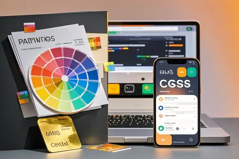
Color systems aren’t just designer jargon—they’re the secret handshake between pixels and paper. Let’s pull back the curtain together.
Why Your Eyes Are Playing Tricks on You
That calming sage green you picked? On phones, it glows like a radioactive avocado. On office printers, it morphs into military khaki. Here’s the kicker: Your screen lies.
I learned this the hard way when my “sunshine yellow” logo turned mustard-brown on 500 conference mugs. The fix? Understanding these four color “languages”:
- HEX/RGB → Digital sorcery
- CMYK/Pantone → Printing alchemy
Let’s decode them like a pro.
Screen Magic: HEX & RGB Explained
HEX Codes (#FFD700)
- What it is: A color’s social security number
- Why it matters: Every web browser speaks HEX fluently
- Pro tip: Use HEX when coding buttons—it’s CSS’s native tongue
/* Good */ background-color: #FF6B6B;
/* Sad */ background-color: “Sorta coral-ish”;
RGB Values (255, 107, 107)
- How it works: Your screen’s tiny light show (Red+Green+Blue = White light)
- Aha moment: Ever notice how neon colors look electric on OLED screens? That’s RGB showing off.
Fun experiment: Open Photoshop and:
- Set a layer to RGB(255,255,255) → Pure white
- Add a 50% black overlay → Now it’s RGB(127,127,127)
- Your brain screams “GRAY!” but your screen’s still blasting full brightness.
When Ink Meets Paper: The Print Reality Check
Pantone: The $500 Lipstick of Colors
- The VIP section: Need your logo’s red to match on billboards and lipstick tubes? That’s Pantone’s jam.
- Cool trick: Their Metallics series makes gold foil look cheap.
- Ouch factor: Printing Pantone costs like adding caviar to a McDonald’s burger.
Real-world drama: Coca-Cola’s “Red 032” is so iconic, they’ve trademarked the Pantone code. Try printing that with household ink!
CMYK: The Everyman’s Color Mixer
- How it breathes: Like a DJ blending cyan, magenta, yellow, and black tracks
- Home printer hack: Next time your résumé’s black text looks charcoal? Blame your printer’s cheap CMYK ink.
- Designer confession: I once sent a client 500 brochures where “rich purple” became… well, let’s call it “moody eggplant.”
Your Cheat Sheet for Color Confidence
| Scenario | Winner | Watch Out For |
|---|---|---|
| App icons | HEX | RGB can vary across devices |
| Branded pens | Pantone | Costs $5/pen vs. $0.50 |
| Office flyers | CMYK | Colors look 15% less vibrant |
| Instagram ads | RGB | HEX ensures exact matches |
“But I’m Not a Designer!” – 3 Foolproof Fixes
- The Starbucks Test
- Find your HEX color → #006241 (their famous green)
- Buy a Starbucks cup → See how it changes in sunlight vs. shadow
- Now you get why they use both Pantone 3425 C and CMYK formulas.
- The Phone-to-Paper Trick
- Take a photo of your screen
- Print it → Notice how colors “flatten”
- That’s RGB light vs. CMYK ink in action!
- The Nightclub Analogy
- RGB = Laser lights (additive color)
- CMYK = Paint splatters (subtractive color)
- Mix lasers? Brighter. Mix paint? Mud.
Your Colors, Your Rules
Remember that time Microsoft’s Zune tried to battle the iPod with brown? Exactly.
Whether you’re choosing HEX values for a startup app or debating Pantone costs for packaging:
Ask this: “Where will people really experience this color?”
- Screens in dark mode? RGB’s your friend.
- Luxury product packaging? Pantone or bust.
- Quick office handout? CMYK won’t bankrupt you.
Now go make that color sing—on every screen, paper, and yes, even coffee mugs.