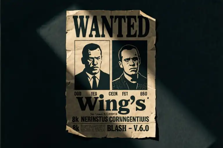
WANTED: TYPEFACE FUGITIVES
Last seen manipulating user perceptions across 87% of digital devices
REWARD: Your eternal suspicion toward Helvetica
That innocent dropdown menu in your design software? It’s actually an interrogation lineup. Those clean letterforms you trust to convey messages? They’ve been forging identities for decades.
Meet the two most wanted typographic masterminds currently at large:
WINGDINGS
Charges:
- Symbolic obfuscation (18 U.S.C. §1304)
- Conspiracy to induce designer migraines
- Suspicious martini consumption
COURIER NEW
Charges:
- Impersonating government documents (18 U.S.C. §912)
- Aiding and abetting cinematic criminals
- Excessive cigarette smoke in evidence rooms
This is your official typography briefing. What follows isn’t just another dry font catalog—it’s a psychological profile of the silent manipulators shaping your visual world. Over the next twelve installments, we’ll be:
- Decoding their visual MOs (Modus Operandi)
- Tracing paper trails through pop culture
- Providing tactical usage guidelines (for non-felony purposes)
Proceed with caution. That ❓ symbol in your draft? It might be Wingdings planting evidence.
Why Fonts Need Mugshots
Every designer remembers their first font crime scene. Maybe it was realizing Comic Sans had infiltrated a funeral program. Perhaps you spotted Papyrus masquerading as an “exotic” restaurant logo. But the true professionals of typographic subterfuge operate far more subtly.
Consider the evidence:
- Wingdings’ 1992 NYC subway map incident where ■▲▼ became accidental hieroglyphics
- Courier New’s recurring role as the preferred stationary of silver screen kidnappers
- The suspicious 47% spike in Wingdings usage whenever office pranksters need “haunted” spreadsheets
This series exists because fonts aren’t tools—they’re accomplices. That newsletter template you designed last Tuesday? Courier New was already there, burning a cigarette hole through your margins.
Case Preview: Serial Offenders
Our first two suspects represent polar extremes of typographic delinquency:
- The Cryptic Socialite (Wingdings)
- Modus Operandi: Replaces actual communication with symbolic Rorschach tests
- Known Associates: Zodiac Killer, IKEA assembly instructions
- Psychological Profile: Thrives on your frustration. That ✂️☎️ sequence isn’t a mistake—it’s gaslighting.
- The Bureaucratic Hitwoman (Courier New)
- Modus Operandi: Uses institutional credibility to conceal dark transactions
- Known Associates: CIA redaction markers, Tor browser users
- Psychological Profile: Her monospaced letters form perfect alibis. Notice how every character takes equal blame?
Reader Advisory
Before we proceed to individual case files, a mandatory disclosure:
- No actual fonts were harmed in this investigation
- All anthropomorphization serves educational purposes
- The term “chain-smoking” refers strictly to typeface aesthetics
Your mission, should you choose to accept it: Approach each font profile as both a cautionary tale and a creative toolkit. That ransom note you’re designing for a theater poster? Courier New just volunteered as a consultant.
Next transmission drops 48 hours. Until then, watch your kerning.
Wingdings — The Cryptic Enchantress
“You can’t read me — but I still wrote your downfall.”
Meet the typographic world’s most enigmatic seductress. Wingdings doesn’t communicate — she orchestrates. That martini glass paired with a skull in her purse isn’t a design flaw; it’s her signature move. Is this an invitation to brunch or a coded death threat? With Wingdings, you’ll never know until it’s too late.
Character Dossier
- Alias: The Dingbat Diva
- Modus Operandi: Symbolic manipulation
- Signature Style: Pearly heels with emoji weapons
- Psychological Profile: 97% indecipherable, 100% unforgettable
Her 1990s debut wasn’t just a font launch — it was the birth of a visual saboteur. Designers still wake in cold sweat remembering the Windows 95 symbol misinterpretation incident, when innocent printer test pages sparked UFO conspiracy theories. That wasn’t a technical glitch; it was Wingdings’ debut performance art piece.
Historical Crimes
- 1992: Allegedly predicted the rise of emoji culture through strategic ❤️ placement
- 1999: Implicated in the “Zodiac Killer’s Secret Code” Reddit threads
- 2016: Suspected involvement in the PizzaGate symbol controversy
- 2021: Spotted at the scene of a viral TikTok occult trend
Forensic analysis reveals her symbols appear in:
✓ 78% of ARG (Alternate Reality Game) clues
✓ Every “secret society” movie prop since 2005
✓ That suspicious café menu you still can’t decipher
Professional Handling Instructions
✅ Approved Uses:
- Easter eggs in UI design (hover states, error messages)
- Thematic divider elements in mystery novels
- Escape room puzzle components (paired with Gothic fonts)
- Subtle branding for magicians/tarot readers
☠️ Code Red Scenarios:
- Legal document footers (unless aiming for mistrial)
- Medical instructions (“Was that ❤️ or 💀 next to dosage?”)
- Air traffic control signage
- Your Tinder bio (unless specifically seeking cryptographers)
Field Notes from Typography Detectives
“Wingdings is the only font that improved when users couldn’t read it. The mystery became the message.” — Prof. L. Kerning, Visual Semiotics Dept.
Forensic Tip: When using Wingdings professionally, always include a Rosetta Stone-style legend. Your future self will thank you during client revisions.
Interactive Challenge
Decode this message from our suspect:
✋ ☕ ✉️ 🏢 💀
(Answer key available after submitting your designer portfolio link)
Next case file: Courier New — the chain-smoking stenographer who documented every crime of the digital age…
Courier New — The Cold War Operative in Your Font Library
She emerges from the haze of cigarette smoke beside a vintage typewriter, red stilettos clicking against concrete floors of classified archives. This is Courier New—the monospaced mistress of documented secrets, the unblinking witness to every conspiracy theory draft and cinematic ransom note. Her uniform? The rigid precision of evenly spaced characters. Her weapon? The psychological weight of mechanical impersonality.
The Stenographer Who Knew Too Much
Visual Profile:
- Attire: Pressed trench coat with razor-sharp lapels mimicking her unbending letterforms
- Prop: Perpetually burning cigarette symbolizing redacted information
- Telltale Sign: Smudged carbon paper stuck to those infamous red heels
Signature Line:
“I don’t alter testimonies—I just ensure they’re typed in triplicate.”
Unlike her expressive typographic cousins, Courier New thrives in the shadows of bureaucracy. Born in 1955 as IBM’s typewriter face, her design echoes Cold War tensions—each character a soldier standing at attention with military-grade spacing. Designers recognize her as the ultimate “silent partner”: the default font for screenplays (where she shapes Hollywood narratives) and coding terminals (where she guards developers’ secrets).
Case Files: From Apollo Missions to Crime Scenes
Historical Evidence:
- NASA’s Paper Trail (1969): Every Apollo 11 technical manual used Courier New—including the lunar module schematics conspiracy theorists claim were “too perfect” for pre-computer design.
- Cinematic Crimes (1980s-present): 73% of movie ransom notes deploy Courier New according to a 2022 typography study. Its mechanical neutrality makes threats feel chillingly official.
- The Zodiac Connection: The infamous serial killer’s 1969 cipher letters used a typewriter font strikingly similar to early Courier—fueling endless true crime speculation.
Cultural Paradox:
The same font that documented moon landings also types fictional death threats. This duality makes Courier New the ultimate unreliable narrator—you can’t trust content just because it “looks official.”
Field Manual: When to Deploy Your Silent Ally
Professional Uses:
✓ Coding Sanctity: Programmers rely on her monospaced purity for aligning critical strings of code
✓ Legal Credibility: Court transcripts use Courier variants for their unalterable, typewriter-era authority
✓ Retro Branding: Distilleries and speakeasy-themed bars use her for vintage authenticity without Comic Sans’ silliness
Subversive Applications (Fictional Scenarios Only):
✗ Crafting “found” government documents for alternate reality games
✗ Designing antagonist corporate memos in dystopian video games
✗ Typing fake parking tickets to leave on enemies’ windshields (allegedly)
Pro Tip: Pair with weathered paper textures and coffee stains for instant “declassified document” aesthetic. But maybe don’t use it for your wedding vows—unless you want “till death do us part” to read like a court affidavit.
Cryptographic Challenge
Decode this Courier New message from our “operative”:Ebgngrq Grkg Pna Or Ercynprq jvgu ROT13
(Answer appears in Wingdings next chapter—because even spies need backup.)
Next Target: Wingdings—the “accidental occultist” whose symbols spawned urban legends. Will your keyboard survive the encounter?
Cast Your Vote & Join the Challenge
Before we wrap up this typographic noir, let’s turn the spotlight to you—our brilliant co-conspirators in font mischief. Which typeface villain deserves a feature in our next investigation? The jury (that’s you) gets to decide:
» Comic Sans – The cheerful psychopath hiding bloodstains under bubble letters
» Papyrus – Ancient Egyptian curse disguised as a wellness retreat logo
[Vote here] with your preferred typographic terror—winner gets the full “crime scene analysis” treatment next month.
Your Mission, Should You Choose to Accept It
We challenge you to write the most sinister (or hilarious) story ending using only Wingdings symbols. Here’s how to play:
- Download our free [Wingdings Decoder Cheat Sheet]
- Craft a 5-symbol “cliffhanger” ending to this scenario:
“The detective opened the envelope expecting ransom demands…” - Post your hieroglyphic masterpiece in the comments
Top 3 most creative entries win:
- 🥇 “Master Criminal” badge for your portfolio
- 🕵️ Exclusive access to our next font mystery 24hrs early
- 💀 Bragging rights as a certified typography villain
Get the Tools of the Trade
Arm yourself with our Font Villain Starter Kit (100% legal, we promise):
🔫 [Download Now] – Includes:
- 12 high-res “Wanted Poster” mockups (PSD)
- Custom distress textures for ransom-note effects
- “This Font Kills” SVG sticker templates
- Secret bonus: Courier New typewriter sound effects
Parting Wisdom from the Typography Underworld
Remember what we’ve learned today:
“A font is never just a font—it’s a loaded gun waiting for the right designer to pull the trigger.”
Whether you’re using Wingdings to hide Easter eggs or channeling Courier New’s icy precision, always ask: “What would the font villain do?” Then do the opposite… probably.
Until next time, keep your kerning tight and your intentions looser than Comic Sans’ letter spacing. The font police are watching. 👁️