We spend countless hours perfecting our products – crafting pixel-perfect interfaces, obsessing over user flows, and debating the emotional impact of micro-interactions. Our JIRA tickets read like love letters to usability. Our design systems could pass museum curation standards. Yet when it comes to how we interact with colleagues, we suddenly abandon all those carefully honed product principles.
The irony stings: the same people who can predict how a first-time user will navigate an app often fail to anticipate how their teammate will receive critical feedback. We architect seamless onboarding experiences while stumbling through basic team introductions. Our Figma prototypes undergo more iteration than our meeting formats.
This disconnect manifests in tangible ways. That brilliant product strategy gets diluted during handoff. The engineering collaboration you assumed was smooth actually created silent friction. The stakeholder alignment you thought existed turns out to be superficial. Like poorly designed software, dysfunctional work relationships create compounding frustration – except there’s no Hotjar session to reveal the pain points.
Here’s the uncomfortable truth: your colleagues experience you as a product. Every interaction – that rushed standup comment, the hastily written Slack message, the deferred 1:1 – contributes to their user experience. And unlike external customers who might churn quietly, these internal users must keep engaging with your ‘interface’ daily, glitches and all.
What makes this realization particularly jarring for product-minded professionals is how obviously we’re violating our own principles. We’d never ship a feature without considering:
- First-time use experience (how new team members perceive you)
- Cognitive load (how easily others process your communication)
- Error states (how you handle misunderstandings)
- Accessibility (how you accommodate different working styles)
- Emotional design (how interactions make people feel)
Yet we routinely ‘ship’ workplace behaviors without any such consideration. The organizational debt accumulates silently until suddenly you’re dealing with the interpersonal equivalent of a crashed production environment – except instead of error logs, you get passive-aggressive emails and meeting sidebar conversations.
This isn’t about becoming artificially pleasant or suppressing professional opinions. Just as good UX isn’t about making interfaces ‘nice’ but making them effective, improving your colleague experience aims for more impactful collaboration. It means applying the same rigorous thinking we use on products to how we:
- Structure meetings (information architecture)
- Give feedback (interaction design)
- Share context (onboarding flows)
- Resolve conflicts (error handling)
The most skilled product leaders I’ve observed operate with this dual awareness – they architect systems while simultaneously shaping the human interactions around those systems. Their secret weapon? Treating internal collaboration with the same intentional design focus they apply to customer experiences.
What changes when we view our teammates as our most important users? Suddenly those product superpowers become relationship superpowers. Your user research skills help map unspoken team dynamics. Your prototyping mindset encourages low-stakes experimentation with new meeting formats. Your usability heuristics reveal why certain conversations keep derailing.
The beautiful paradox is that by focusing on your colleagues’ experience, you ultimately create better products anyway. Smooth internal collaboration means faster decision-making, clearer requirements, and more psychological safety for creative risk-taking. That pixel-perfect interface means little if the team behind it is misaligned.
So before we dive into practical frameworks, pause and consider: What’s the current NPS score of your interpersonal ‘product’? How might applying your existing design skills transform those daily interactions? The tools you need are already in your toolkit – you just haven’t been using them on what might be your most important user base.
Your Colleagues Are Power Users
We obsess over pixel-perfect interfaces and seamless user flows, yet routinely tolerate dysfunctional team dynamics. That product launch where engineers missed the deadline because requirements changed last minute? The design critique that left everyone defensive? The Slack thread that sparked unnecessary conflict? These aren’t just workplace frustrations—they’re UX failures in our internal systems.
The Five Dimensions of Workplace Experience
1. Usability
Can colleagues easily understand your expectations? That Jira ticket with ambiguous acceptance criteria creates the same friction as a poorly labeled form field. Engineers shouldn’t need to decode your thought process like users struggling with cryptic error messages.
2. Efficiency
Stand-up meetings that drag resemble bloated onboarding flows. When a designer spends 30 minutes explaining a decision that could’ve been async, it’s the equivalent of forcing users through unnecessary steps.
3. Emotional Resonance
Code review comments that say \”This implementation is stupid\” trigger the same visceral reaction as a harsh error message. The tone we use in PR feedback carries comparable weight to microcopy in a checkout flow.
4. Consistency
Changing project priorities without context mirrors a navigation structure that reorganizes weekly. Product managers who alter requirements without explanation create the workplace version of a broken information architecture.
5. Discoverability
When critical decisions get buried in Slack threads rather than documented in Notion, it replicates poor content hierarchy. Colleagues shouldn’t need to search like users hunting for hidden features.
The Blind Spot Audit
Take this quick self-assessment:
- When was the last time you user-tested a meeting format?
- Do you maintain style guides for internal communications like you do for UI components?
- Have you ever created empathy maps for stakeholders like you would for customers?
Most product teams invest hundreds of hours in external user research while making zero effort to understand their colleagues’ mental models. The marketing manager requesting last-minute changes isn’t being difficult—they’re a user operating with different constraints and success metrics.
The Hidden Cost of Bad Internal UX
That sprint where half the team was blocked because approvals got stuck in legal? The two weeks lost to misaligned dependencies between design and engineering? These aren’t inevitable workplace realities—they’re the accumulated debt of unoptimized colleague experiences.
Consider how we measure external UX:
- NPS scores for customer satisfaction
- Session recordings to observe pain points
- A/B tests to optimize flows
Now contrast that with how we handle internal interactions:
- No metrics for meeting effectiveness
- No research into why decisions get stuck
- No iteration on communication patterns
The irony is palpable. We build sophisticated systems to understand strangers while remaining oblivious to the people sitting three desks away. Your colleagues interact with your work daily—they’re your most frequent, most invested users. Isn’t it time we gave them the same consideration we give our customers?
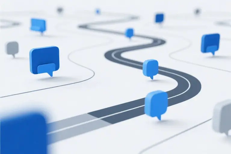
Mapping the Hidden User Journeys Around You
We spend weeks perfecting customer journey maps, plotting every touchpoint from first click to loyal advocacy. But when was the last time you mapped how colleagues experience working with you? That engineering manager who reviews your specs, the junior designer awaiting your feedback, the product marketer decoding your roadmap – they’re all navigating an invisible interface you’ve designed through daily interactions.
The Six Archetypes in Your Workplace Ecosystem
Every internal user comes with unique mental models, just like our external users. Consider these six colleague personas:
The Pragmatic Engineer
- Primary Goals: Code stability, clear requirements, minimized context switching
- Pain Points: Vague acceptance criteria, moving goalposts, overdesigned solutions
- Emotional Drivers: Pride in craftsmanship, aversion to perceived inefficiency
The Vision-Driven PM
- Primary Goals: Strategic alignment, measurable outcomes, stakeholder buy-in
- Pain Points: Implementation bottlenecks, scope ambiguity, metric myopia
- Emotional Drivers: Market impact anxiety, validation needs
The Context-Seeking Designer
- Primary Goals: User truth discovery, cohesive experiences, creative integrity
- Pain Points: Last-minute changes, solution-first briefs, diluted design intent
- Emotional Drivers: Fear of compromise, desire for artistic recognition
The Metric-Obsessed Marketer
- Primary Goals: Message consistency, conversion optimization, campaign velocity
- Pain Points: Technical jargon, delayed asset delivery, undefined success metrics
- Emotional Drivers: FOMO on trends, attribution anxiety
The Calendar-Juggling Executive
- Primary Goals: Risk mitigation, resource allocation, investor confidence
- Pain Points: Information overload, decision paralysis, team dissonance
- Emotional Drivers: Legacy concerns, time scarcity stress
The Multitasking Program Manager
- Primary Goals: Timeline adherence, dependency management, conflict resolution
- Pain Points: Siloed teams, uncommunicated blockers, shifting priorities
- Emotional Drivers: Control loss anxiety, facilitator identity
Experience Assessment Matrix
Map your last two weeks against these interaction dimensions:
- Cognitive Load Index (1-5)
How much mental effort did you require from them? Count unnecessary explanations, rework requests, or ambiguous asks. - Emotional Resonance Score (1-5)
Did exchanges leave them energized or depleted? Track defensive responses, enthusiastic follow-ups, or communication avoidance. - Time-to-Value Ratio
Minutes spent versus tangible outcomes achieved. Calculate meeting hours versus decisions made, or email threads versus clarity gained. - Friction Hotspots
Recurring pain points across interactions. Note repeated clarification needs, process breakdowns, or consistent delays.
The Figma Template That Changed Everything
Our team’s breakthrough came when we adapted our UX research toolkit for internal use. The editable Figma template includes:
- Empathy Map Quadrants for each key stakeholder
- Service Blueprint Layers mapping formal and informal processes
- Emotional Journey Waves plotting confidence and frustration levels
- Opportunity Heatmaps highlighting low-effort/high-impact improvements
Pro tip: Layer in Slack message analysis. The average professional makes 36 micro-interactions daily through chat – each a mini usability test of your communication design. Track response latency, message length patterns, and emoji usage as emotional proxies.
What emerges isn’t just a map, but a mirror. The gaps between how you intend to collaborate and how colleagues actually experience that collaboration often reveal the very same disconnects we diagnose in poor product experiences. Only this time, you’re both the designer and the interface.
Redesigning Daily Interactions with UX Principles
That moment when you realize we’ve spent three hours debating the border radius of a notification badge, yet routinely subject colleagues to rambling Slack messages that would fail even the most basic usability test. The disconnect between how we craft digital experiences and how we design human interactions at work isn’t just ironic—it’s professionally costly.
Meeting Design: Beyond Agenda Items
Consider the typical product sync: fifteen people in a room (or Zoom grid), half distracted by notifications, discussing tickets nobody pre-read. We’d never ship a user flow this broken. Apply these meeting UX upgrades:
Cognitive Load Management
- Replace bullet-point agendas with visual storyboards showing discussion arcs
- Implement ‘pre-heating’—share key data points 24hrs early asynchronously
- Designate a ‘context engineer’ role to verbally recap threads after distractions
Interaction Patterns
- Apply Fitts’s Law to participation: Place important contributors centrally in physical rooms
- Use progressive disclosure—keep initial discussions broad before drilling into details
- Build in micro-interactions: Structured pauses for note-taking, explicit handoffs between speakers
Emotional Affordances
- Start with ‘temperature checks’ (emoji reactions to current energy levels)
- Designate a ‘devil’s advocate’ role to safely surface objections
- End with ‘appreciation micro-interactions’—30-second shoutouts
[Sample Meeting Template]
## {Project} Sync (v2.1)
**Pre-conditions:**
- [ ] Metrics deck reviewed (link)
- [ ] Roadmap changes flagged (section 3.2)

**Flow:**
1. Context refresh (3min max) ← [Name] owns
2. Blockers → Solutions (15min) ← [Name] facilitates
3. Decision points (7min) ← [Name] documents
4. Action calibration (5min) ← All confirm
Async Communication: The Slack UI You Never Built
Our Slack channels resemble overcrowded subway cars—everyone shouting, nobody navigating. Treat message threads like product surfaces:
Information Architecture
- Apply the ‘three-click rule’: Key points should be graspable within three screen lengths
- Use formatting consistently (bold for actions, italics for context)
- Create channel-specific posting guidelines (e.g., #engineering only allows Loom clips under 90sec)
Microcopy Matters
- Replace “Thoughts?” with specific prompts: “Option A/B preference by EOD?”
- Use status indicators: “[DRAFT]” for unfinished ideas needing input
- Apply progressive disclosure: Put conclusions first, reasoning in threads
Emotional Tone
- Designate ‘reaction emoji’ meanings: 👀 = “reviewed but no action needed”
- Implement typing indicators: “Working through a complex thought → message in 5min”
- Build in ‘error states’: “Realizing my last message was unclear—let me rephrase”
Conflict as a Design Problem
That heated design critique where everyone left bruised? It’s a UX fail. Reframe tough conversations using interaction design principles:
Feedback Components
- Use standardized templates:
“When [observation], I felt [impact] because [assumption]. Could we try [experiment]?” - Apply visual hierarchy to criticism: Lead with alignment points before divergences
- Implement ‘lazy loading’ for emotions: “I need 10min to process before responding”
Navigation Aids
- Create ‘you are here’ markers in difficult talks: “We’ve covered the what, now discussing how”
- Design escape hatches: “This feels stuck—could we park it and revisit Tuesday?”
- Build in undo actions: “I regret how I phrased that—let me try again”
Emotional White Space
- Schedule buffer time between tough conversations
- Use physical proxies for tension (standing meetings, walking discussions)
- Designate ‘recovery rituals’ post-conflict (e.g., team coffee break)
The secret isn’t becoming someone you’re not—it’s applying the professional judgment you already possess to the human systems around you. Your colleagues deserve the same thoughtful design you give to pixels and workflows. Start with one interaction today—the meeting you’re about to run, the Slack thread you need to reply to—and build from there.
The 30-Day Influence Experiment
We measure app load times down to the millisecond, track conversion funnels with scientific precision, and obsess over user retention curves. Yet when it comes to the most critical interface we work with daily – our relationships with colleagues – we operate on gut feelings and vague impressions. This disconnect costs more than we realize.
Your Personal UX Influence Scorecard
Start by auditing your current workplace interactions through the lens of five influence dimensions:
- Clarity Coefficient: How often do colleagues need to seek clarification after your communications? Track instances where your Slack messages or meeting comments generated follow-up questions.
- Friction Frequency: Note situations where collaboration stalled due to misunderstandings or mismatched expectations. These are your usability bugs in human interactions.
- Energy Impact: After 1:1s or team syncs, does your presence leave others energized or drained? Like app performance metrics, this emotional latency matters.
- Alignment Accuracy: When delegating or receiving tasks, what percentage of deliverables match initial intentions without rework? This is your requirements specification success rate.
- Trust Velocity: How quickly do new team members become comfortable seeking your input? Measure the onboarding period before they freely share half-formed ideas.
Create a simple dashboard scoring each dimension weekly. Treat this like your personal NPS (Net Promoter Score) for workplace relationships. The goal isn’t perfection, but establishing your baseline metrics.
The Incremental Improvement Roadmap
Break your 30-day experiment into four focused sprints:
Week 1: Clarity Overhaul
Rewrite all asynchronous communications using the inverted pyramid method from journalism. Lead with the single most important point or request. Apply the 30-second rule: If a colleague can’t grasp your core message in half a minute, redesign it.
Week 2: Friction Reduction
Identify three recurring collaboration pain points. For each, prototype alternative approaches like you would test UI variations. Maybe that design critique works better as a Loom video instead of live feedback. Perhaps technical specs need visual story supplements.
Week 3: Energy Optimization
Schedule five-minute “user interviews” with two colleagues daily. Ask: “What’s one interaction this week that felt particularly smooth or frustrating?” Look for patterns like you would analyze usability test results.
Week 4: Trust Acceleration
Implement small reliability boosters – consistently ending meetings five minutes early, summarizing action items in a shared format, or publicly crediting others’ contributions. These are like the micro-interactions that make digital products feel polished.
Measuring Cross-Functional NPS
Adapt the Net Promoter Score framework for internal relationships:
- Ask colleagues: “On a 0-10 scale, how likely are you to recommend collaborating with me to someone on another team?”
- Categorize responses as Detractors (0-6), Passives (7-8), or Promoters (9-10)
- Calculate your score: %Promoters – %Detractors
The magic happens in the follow-up question: “What one change would make you more likely to give a higher score?” Treat this qualitative data like user interview insights – look for themes, not outliers.
Remember, this isn’t about popularity. Just as product metrics reveal usability truths, your relationship metrics surface real collaboration barriers. The designer who discovers colleagues dread her feedback sessions isn’t failing – she’s found her most valuable iteration opportunity.
Unlike shipping product features, improving human interfaces requires constant maintenance. But the compounding returns – smoother collaborations, faster decisions, more psychological safety – make this the highest-ROI work you’ll ever do. Your org chart position matters less than how people experience working with you day to day. That’s the interface worth perfecting.
The Architecture You Can Feel
We began with a simple truth: customers feel your org chart even if they never see it. Now we’ve come full circle to realize this applies even more powerfully to the people sitting next to you every day. Those meticulously crafted user experiences you design? Your colleagues are living through their workplace equivalent in every interaction with you.
The tools we’ve explored aren’t just about becoming better coworkers – they’re about making the invisible architecture of relationships tangible. That Slack message you craft with the same care as an error state microcopy? That’s structural reinforcement. The meeting you design with participant personas in mind? That’s load-bearing communication.
For those ready to put these ideas into practice, we’ve compiled every template, checklist and assessment into a single toolkit. You’ll find journey map frameworks adapted for engineering standups, emotional design principles for stakeholder meetings, and even NPS surveys calibrated for internal teams. Consider it your relationship design system – download it and start building.
This work bridges an artificial divide we’ve created between professional excellence and human connection. The same mind that obsesses over pixel-perfect interfaces can cultivate psychologically safe environments. The rigor applied to user flows can transform cross-functional collaboration. Your technical expertise and interpersonal influence aren’t competing priorities – they’re complementary forces that multiply your impact.
As you leave these pages, carry forward this dual vision: See your colleagues with the same clarity as your users, and recognize that every exchange is another brick in the architecture they experience daily. The most elegant solutions emerge when we design for both.