Fourteen years in education taught me many things, but technological proficiency wasn’t among them. When a small budget surplus appeared—one of those rare moments of fiscal breathing room—I decided our department deserved an upgrade. The old camera had served us well, but its limitations were becoming difficult to ignore: grainy footage, cumbersome tapes, and that faint whirring sound that distracted students during recordings.
So I purchased a sleek digital model, all matte black surfaces and mysterious buttons. This wasn’t merely about replacing equipment; it represented something more significant. In education, resources matter. The right tools can transform how we document field trips, capture student presentations, or create teaching materials. That underspent budget allocation became an investment in better storytelling.
My relationship with technology has always been… thoughtful. Where some people see intuitive design, I see hieroglyphics waiting to be deciphered. Gadgets don’t speak my language naturally—we need interpreters. Manuals become bedtime reading, buttons transform into philosophical puzzles, and every new function feels like learning a dialect I didn’t know existed.
Yet this process brings its own satisfaction. There’s something genuinely rewarding about moving from confusion to competence through sheer persistence. Digital interfaces often assume prior knowledge I don’t possess, creating gaps between what devices can do and what users actually experience. That space between capability and usability—that’s where frustration grows, but also where understanding eventually blossoms.
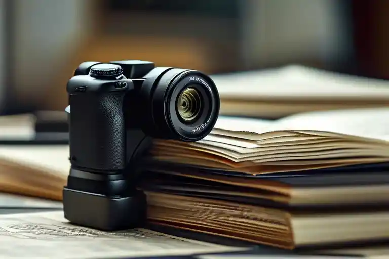
The camera arrived in minimalist packaging that felt almost insultingly simple compared to the complexity within. I remember turning it over in my hands, admiring its weight distribution, wondering how something so small could hold so many possibilities. Little did I know that within hours, this shiny object would teach me more about interface design than any manual ever could.
The New Gadget Dance
Instruction manuals have a certain feel to them—that slightly waxy paper, the faint smell of new printing, the weight of promised functionality held in one hand. In the other, the camera itself, cool and smooth, a black rectangle of potential. This was the dance, fourteen years ago and in many ways still today: human versus interface, curiosity versus complexity.
I’ve never been what you’d call gadget-savvy. Technology and I have an understanding: I respect it, and it occasionally works for me. There’s a learning curve, often more of a zigzag, but eventually I find my way. That day, with a brand-new digital camera—a modest luxury made possible by a small budget surplus—the process began as it always does. One button at a time, one function at a time.
The transition from photo to video mode felt like a minor triumph. Press one clearly marked button, and voilà—the screen shifted, the icon changed, the camera was ready to capture motion. A three-second test clip, nothing more than my own hand moving in and out of the frame, felt like a genuine accomplishment. There’s a quiet satisfaction in making a new piece of technology do what it’s supposed to do, especially when you’re not entirely sure how you got there.
That satisfaction, though, is fragile. It hinges on everything working as expected, on logic holding up. For a few moments, it did. The camera obeyed. I felt in control. But that feeling, as it often does with new devices, was about to meet reality.
The Struggle with Simple Things
That fleeting moment of triumph quickly evaporated. There I stood, camera in hand, suddenly trapped in a digital labyrinth of my own making. The very button that had granted me access to video now refused to grant me exit. Each press returned me to the same video menu, a circular pathway that seemed designed to mock my attempts at escape.
The interface presented what appeared to be a comprehensive menu system—options for video quality, sound settings, playback functions—all the trappings of a well-designed system. Yet it lacked the one thing I desperately needed: a clear path back to photography. The design assumed that once you entered video mode, you’d want to remain there indefinitely, or that finding your way out would be intuitively obvious. It was neither.
Minutes stretched into what felt like hours as I pressed every button combination I could imagine. The power button, the zoom toggle, the display settings—each yielded nothing but further confirmation of my entrapment. The camera had become a perfect metaphor for how technology sometimes feels: powerful yet incomprehensible, capable yet stubbornly resistant to human intuition.
There’s a particular frustration that sets in when you know the solution must be simple, yet it remains elusive. My fingers moved with increasing urgency, then with deliberate slowness, then with what can only be described as technological despair. The instructions offered no guidance—they explained how to enter video mode but remained mysteriously silent on how to exit it.
What made this experience particularly grating was the knowledge that I wasn’t attempting anything complex. I wasn’t trying to program custom functions or set up wireless transfer. I simply wanted to return to taking photographs, the camera’s primary purpose, the reason I’d purchased it in the first place.
The thirty minutes I spent trapped in video mode felt like a small eternity. Each failed attempt reinforced the growing suspicion that perhaps the problem wasn’t the camera, but me. Maybe I’d missed something obvious. Maybe my age was showing. Maybe technology had finally moved beyond my capacity to understand it.
This struggle highlights a fundamental truth about product design: the most elegant solutions often become barriers when they fail to account for how people actually use things. The camera’s designers had created a clean separation between photo and video functions, but in doing so, they’d created a digital divide that left users stranded on the wrong side.
The experience taught me something about persistence too. There’s value in continuing to try different approaches, even when logic suggests they shouldn’t work. My frustration grew, but so did my determination. The camera would not defeat me. I would find my way back to photography, even if it meant trying every possible combination of buttons and settings.
What’s interesting about such struggles is how they reveal the gap between theoretical design and practical use. The engineers who designed this camera likely never considered that someone might want to quickly switch between photo and video modes. They built what seemed logical from a technical standpoint, but failed to consider the user’s perspective.
There’s also the psychological dimension of such experiences. Each failed attempt chips away at your confidence, making you question not just the device, but your own competence. The camera remained silent, indifferent to my growing frustration, its sleek exterior hiding the complexity within.
This particular struggle—being trapped in a function I didn’t want to use—speaks to a larger issue in technology design. We’ve become so focused on adding features that we sometimes forget to ensure they work harmoniously with existing functions. The camera could shoot video beautifully, but at the cost of making photography suddenly inaccessible.
The time spent wrestling with this problem wasn’t wasted, though I certainly felt it was in the moment. It taught me about patience, about reading instructions more carefully, and about the importance of designing technology that understands human behavior rather than fighting against it.
What stayed with me most was the realization that sometimes the solutions to our technological struggles are right in front of us, hidden in plain sight. We look for complex answers when simple ones exist. We assume the problem requires a sophisticated solution when often it demands nothing more than a different perspective or a willingness to try the obvious thing we haven’t yet attempted.
The Unexpected Solution
After what felt like an eternity of pressing the same button with increasing desperation, something shifted in my approach. The frustration began to morph into genuine curiosity—that quiet, persistent voice that often emerges when we stop trying so hard to be right and simply start exploring. My fingers, almost of their own accord, drifted from the problematic function button to the familiar shutter release. There was no logical reason to press it—the camera was still in video mode, after all—but sometimes the most illogical actions yield the most surprising results.
The moment my index finger depressed the shutter button, everything changed. Not with a dramatic fanfare, but with that satisfying click that photographers know so well. The camera didn’t just switch back to photo mode; it did so with such effortless grace that I actually laughed aloud. All that struggling, all that menu navigation, all that time spent convinced I was facing some complex technological puzzle—and the solution was literally at my fingertips the entire time.
This experience speaks volumes about how we interact with technology, especially when it comes to camera usability and digital interface design. We’re trained to believe that modern gadgets require complex solutions, that there must be a specific sequence or hidden menu for every function. Yet often, the most intuitive solution—the one that aligns with how we naturally want to interact with a device—is right there, waiting for us to trust our instincts rather than overcomplicate things.
What’s particularly interesting is how this mirrors the broader challenges of technology adaptation. We approach new devices with a certain apprehension, assuming they’ll be difficult to master. This mental barrier often prevents us from discovering the elegant simplicity that good product design can offer. The camera’s designers had actually created a logical system—press the shutter to return to the primary function—but my own assumptions about digital complexity prevented me from seeing it.
There’s a lesson here about the importance of maintaining that childlike curiosity when faced with technological challenges. Instead of immediately reaching for the manual or assuming we’ve encountered a design flaw, sometimes we need to play with the device, to experiment without fear of breaking something. This approach often leads to those ‘aha’ moments where the gadget’s operation suddenly makes perfect sense.
Of course, this isn’t to say that all technology is intuitively designed—far from it. Many digital products suffer from exactly the kind of interface issues that created my initial confusion. But my experience suggests that sometimes the problem isn’t entirely with the gadget’s usability, but with our approach to learning it. We’ve become so accustomed to complex systems that we overlook simple solutions.
This moment of discovery changed how I approach all new technology now. I spend less time anxiously studying manuals and more time simply interacting with the device, pressing buttons to see what happens, exploring menus without specific goals. This playful approach often leads to faster mastery and fewer moments of frustration. It turns the process of technology adaptation from a stressful test of competence into an enjoyable exploration.
The real irony, of course, is that the solution was always there—not in some hidden advanced menu, but in the most fundamental function of any camera: the shutter button. It was a reminder that sometimes progress isn’t about adding more features or complexity, but about understanding the elegant simplicity that already exists.
This experience also highlights an important aspect of product testing that often gets overlooked: the value of observing how non-technical users interact with devices. Had the designers watched someone like me struggle with their camera, they might have realized that while their system was logically consistent, it wasn’t intuitively obvious to everyone. The best user experience design anticipates these moments of confusion and creates systems that feel natural rather than learned.
There’s something deeply human about this entire experience—the frustration, the persistence, the moment of discovery, and the subsequent reflection. It’s these moments that remind us that technology should serve human needs and instincts, not force us to adapt to its logic. The best gadgets feel like extensions of our capabilities rather than obstacles to overcome.
What remains most vivid in my memory isn’t the frustration or the confusion, but that moment of delightful surprise when the simplest possible action solved what had seemed like an insurmountable problem. It’s a feeling I’ve carried with me through countless other technological challenges, a reminder that sometimes the answer is simpler than we think, if only we’re willing to approach problems with curiosity rather than determination.
The Design Paradox
Looking back at that camera incident, what strikes me most isn’t my technological clumsiness—though there was plenty of that—but how the design failed the user. The camera’s interface created an invisible barrier between intention and action, something I’ve encountered repeatedly with various gadgets over the years. That thirty-minute struggle wasn’t about intelligence or technical capability; it was about design logic that didn’t account for how real people actually interact with technology.
Most product designers operate from a place of deep familiarity with their creation. They understand the internal architecture, the logical pathways, the intended user flow. But this intimate knowledge creates a blind spot—the inability to see the product through the eyes of someone encountering it for the first time. The camera’s video-to-photo transition problem exemplified this disconnect: the solution existed (a simple shutter press), but the pathway to discovery remained hidden behind layers of assumed knowledge.
This experience reflects a broader issue in technology usability. Manufacturers often prioritize adding features over refining core functionality. The camera could shoot video—a impressive feature for its time—but at the cost of making its primary function less accessible. This trade-off between innovation and usability affects countless devices, from smartphones to kitchen appliances, creating what I’ve come to call the “complexity paradox”: as devices become more capable, they often become less intuitive.
For non-technical users—which describes most of us when facing unfamiliar technology—this complexity creates genuine anxiety. That moment of pressing the same button repeatedly, watching the same unhelpful menu appear, generates a particular kind of frustration mixed with self-doubt. Am I missing something obvious? Is this technology beyond my capabilities? These questions arise not from user deficiency but from design oversight.
The concept of “affordance”—how an object’s design suggests its proper use—was clearly missing from that camera’s interface. The video function button afforded pressing, but it didn’t afford understanding. There was no visual or tactile indication that the shutter button now served as the escape hatch from video mode. Good design makes such relationships visible; poor design hides them behind identical-looking buttons and inconsistent behaviors.
This visibility problem extends beyond physical buttons to digital interfaces. How many times have you searched through settings menus looking for one specific option? How often have you encountered terminology that means something different to engineers than to ordinary users? These small moments of confusion accumulate into significant barriers to technology adoption, particularly for those who didn’t grow up surrounded by digital interfaces.
What makes this particularly frustrating is that solutions often exist in plain sight. The camera’s shutter button was right there, available the entire time. But without some indication of its dual function in video mode, it might as well have been hidden. This speaks to the importance of feedback in design—not just visual or auditory signals, but logical consistency that helps users build accurate mental models of how devices work.
The experience taught me that struggling with technology isn’t a personal failing but a design opportunity. Every moment of user confusion represents a chance to make something clearer, more intuitive, more humane. The best technologies feel inevitable in their operation—their functions seem obvious in retrospect. We shouldn’t need instructions to perform basic operations, nor should we feel inadequate when we can’t immediately decipher a device’s logic.
Perhaps the most valuable insight from that afternoon spent with the camera is that simplicity isn’t about removing features but about making complexity manageable. It’s about creating clear pathways through functionality, providing gentle guidance when users stray from intended paths, and ensuring that core functions remain accessible regardless of what other capabilities a device might possess.
This reflection isn’t about blaming designers—creating intuitive interfaces is genuinely difficult—but about advocating for greater emphasis on user experience in technology development. The best products don’t just work well; they feel right in your hands, their operations becoming extensions of intention rather than obstacles to overcome. They understand that human beings bring their entire history of interactions with objects to every new device, and they build upon that foundation rather than ignoring it.
That camera eventually taught me more about design philosophy than about photography. Its failure to communicate basic functionality revealed how much we take good design for granted—and how painfully obvious bad design becomes when we encounter it. The experience left me with lasting appreciation for products that respect their users’ time, intelligence, and frustration thresholds.
Maybe that’s the ultimate test of good design: not whether it can do impressive things, but whether it can do simple things simply. Whether it meets users where they are rather than demanding they ascend to its level of complexity. Whether it remembers that technology serves human purposes, not the other way around.
The Camera and the Shutter
Looking back now, what strikes me most isn’t the mild frustration of those thirty minutes—it’s the quiet lesson in how we expect things to work, and how often they don’t. That little digital camera, sleek and promising, was a perfect metaphor for so much of the technology we encounter: powerful, capable, but sometimes strangely oblivious to the person holding it.
I’ve thought about that moment often over the years, especially as new gadgets arrive with ever more features and ever more convoluted ways to access them. It wasn’t that the camera was badly made, or that the manual was poorly written. It was that the logic of its design didn’t match the logic of my intuition. I pressed a button to enter video mode, and it made sense that pressing it again would take me back. But it didn’t. Instead, it sent me deeper into a menu that had nothing to do with what I wanted.
There’s something deeply human in that struggle—a reminder that good design isn’t just about what a device can do, but how it feels to use it. The best tools seem to understand us. They anticipate our mistakes, forgive our missteps, and guide us back when we wander off course. They don’t ask us to think like machines; they meet us where we are.
That camera didn’t do that. At least, not until I stumbled upon the solution by accident. Pressing the shutter button shouldn’t have been the answer—it wasn’t labeled “return,” it wasn’t highlighted in the manual, it wasn’t hinted at in the menu. But it worked. And in doing so, it revealed a kind of design irony: sometimes the way out isn’t through another button or another setting, but through the one action that feels most natural.
This experience isn’t unique to cameras, of course. We’ve all faced versions of it—the remote control that requires a doctorate to operate, the app that hides its most useful feature behind three submenus, the car console that distracts more than it assists. These aren’t failures of technology; they’re failures of imagination. They happen when engineers design for specs instead of people, when interfaces prioritize options over clarity.
What stayed with me, beyond the minor triumph of finally taking a photo again, was the quiet realization that usability isn’t a luxury—it’s the essence of good design. It’s what separates tools that empower us from those that frustrate us. And it’s something we ought to demand more often, not just as consumers but as humans trying to make sense of a world increasingly shaped by buttons, screens, and menus.
Maybe that’s the real takeaway here. Not that I eventually figured out the camera, but that the camera never really figured me out. And in the gap between what it offered and what I needed, there’s a space worth thinking about—a space where better design begins.